Turning design on its head
Consumer trends, especially in the US and UK, are changing at breakneck speed. Here, Lauren Eads discovers the cutting-edge design trends from producers hoping to keep pace.
The old adage, “A picture is worth 1,000 words” is perhaps no more pertinent than within the world of drinks design and packaging. In a few short brush strokes, a brand is expected to communicate its personality, purpose and position with elegance and impact, informing consumers not only of what’s inside a bottle, but its product’s wider narrative in the hope of hooking their interest. In an increasingly saturated market with boundless choice, this is a tough task. Consequently, producers must be ever more canny in their use of design to stand apart from the crowd. Whether it’s an eye-catching gimmick, fresh format or technological wizardry, clever and compelling packaging and design is half the battle to brand success.
INTELLIGENT DESIGN
One way that brands are forging ahead is by intelligent design. Combining technology with traditional packaging, brands are creating new ways of interacting with consumers, while at the same time collecting valuable market data through which to target further sales. Pioneering this trend is Diageo, which earlier this year unveiled a “smart bottle” prototype for its Johnnie Walker Blue Label Scotch whisky. Using patent-pending OpenSense Technology, extremely thin, electronic sensors can tell if the bottle has been opened and where it is in the supply chain. Not only do these sensors allow Diageo to send information to customers who scan the bottle with their smartphones, but update that information appropriately. For example, Diageo could send promotional offers to a consumer’s smartphone while the bottle is in the shop, but change that information to cocktail recipes once the sensors recognise that the bottle is at home and has been opened. “We always approach what we can do from a consumers’ needs perspective rather than technology, and then we look at which technology can best enable what consumers are looking for”, says Venky Balakrishnan, global VP for digital innovation at Diageo.
“There has been a phenomenal amount of digital interaction happening with our brands so we thought, ‘what if we built some smartness into the bottle?’ The bottle knows when it has been bought and when it has been opened. The number of possibilities this unlocks for us is quite interesting and we haven’t even scratched the surface of what we could do. “This is not a fixed point in any case, it is constantly evolving and changing and getting more sophisticated. What we have started here is exploration and experimental,” he says. The smart bottle is the first project to come out of Diageo Technology Ventures, a programme established in September 2014 to unlock new opportunities for future growth by working with emerging technology companies. “Everything is getting a bit smarter and therefore there is an expectation that everything must rise to have a level of intelligence”, says Balakrishnan. “That is what’s happening with products everywhere. In some ways it’s very difficult to calibrate if you are ahead or behind of consumers, but one thing we are clear on is that this is the direction things are headed, and at Diageo we have to be prepared for it. This is just one of a series of things that we are exploring in a technology space. It is by no means the end game.”
Diageo isn’t the only big brand toying with technology. Belvedere vodka, known for its tall, frosted bottle with an image of Warsaw’s Royal Palace, is also combining technology with design. After confirming a multi-million deal with upcoming James Bond film Spectre, the brand unveiled two limited edition bottles, one of which features LED lighting. When active, the bottle illuminates through laser-cut etchings.
THE URBAN WOODSMAN
But while spirits producers seem to be taking a thoroughly modern approach to design, others are using it to kick back against the digital age and regress into the past. Recounting a recent focus group on wine design, Kevin Shaw, founder of drinks design agency Stranger and Stranger, notes the continued influence of millennials, who “hissed like scolded cats when they saw overt marketing”. Citing the group’s preference for Robert Mondavi labels over Sine Qua Non labels, Shaw said he “almost cried”.
“They knew what varieties were, what oak meant, and they were completely turned off by anything that wasn’t playing it straight”, says Shaw. “Millennials like authentic, retro, straight, which is almost moving backwards”, adds Shaw. “They’re a great group because they can’t resist telling the entire world about everything they do, so if you get it right you really don’t need a marketing budget at all, they’ll market it themselves, but you still need a hook.”
Partner Content
Abigail Barlow, director of wine design agency BD Creative, agrees, describing a desire for retro design as the “urban woodsman” effect. Driven by the “hipster” generation and the so-called “bearded men” of urban London, Barlow says it is a style that is “pared back and simplistic”, but which has at its base is something that has been around for a while.
“In the UK we are moving to something that feels a bit more crafted with a more retro feel”, she says. “That has not applied to other markets in Europe as strongly. We are seeing a lot of use of hipster influence. It’s more about the artisan and a modern interpretation of another age in a way – it’s low-fi. I’m not saying that it is in the mainstream, but we are starting to see it filter through in the on-trade. In other markets, if they are aware of that trend its interpretation is different. Certainly in markets like Russia that trend is not understood at all, or in China,” she continues.
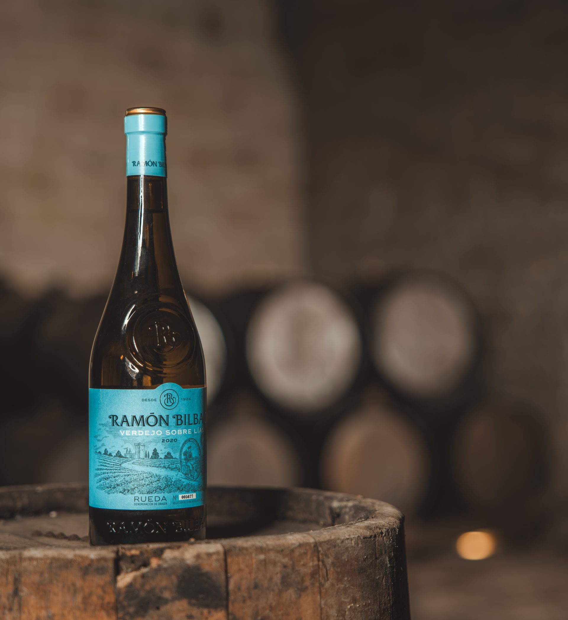
Examples cited by Barlow include Grant’s Cherry Brandy, available to the on-trade through Shepherd Neame, Russian Jack for Majestic through Foley Family Wines and Tunante for Morrisons through PLB. All of these brands are doing something “retro” or “nostalgic” by combining older-style illustrations, crests, icons or typography in a more contemporary way, says Barlow. “Each design implies a slightly different era, but they all have something that harks back to another age or time”. Asda meanwhile is set to launch a “Wine Atlas” range at the end of May, featuring designs inspired by travel posters from the last century. “The range is all about rediscovering forgotten grapes and regions so the nostalgic design really fits with the wine inside”, says Barlow. “The full colour labels are also the perfect antithesis to the ‘wall of white’ we see so often in many supermarkets today.”
This shift toward the retro is the most significant trend currently taking place within wine design, with Barlow describing it a “mild rebellion” to the digital age by millennials, nostalgic for an era they never experienced. “It feels a bit more handcrafted. It’s partly to do with the desire to feel individual is the best way of explaining that. I think that’s where it’s all coming from,“ she comments. “I see it staying around for some time because for me it goes back to the whole thing about the upset of the digital world. If everything is in high definition and all beautifully photographed, then this is something that goes against that: it is the antithesis.”
BACK TO THE FUTURE
As the battle to maintain the attention of retro-minded millennials continues, a two-pronged approach to design is emerging. While some brands are looking to the past to build their future, others are hedging their bets on the allure of technology. With design agencies declaring consumers to have ever-shorter attention spans, more choice than ever and an ephemeral outlook on life encouraged by social media, the need to innovate to stay ahead of the curve has never been more crucial. Predicting where that curve might lead next is the real trick to brand success. As Shaw warns, “brands, like sharks, have to keep moving or die and, like sharks, they have to move in the right direction.”


You actually make it seem really easy together with your presentation but I in finding this matter to be really something that I feel I would by no means understand. It sort of feels too complex and extremely broad for me. I’m looking forward for your next publish, Ill try to get the cling of it! cdbbeekdkgddadga